
Werk.dance
The features were there. The path to them wasn't.
The Challenge
Werk.dance had everything a dance instructor needed to run their business — but no way to surface it. Teachers couldn't discover what the platform could do. I designed the first end-to-end onboarding to change that.
Role
Lead Product Designer
Timeline
May 2026 - June 2026
Platform
Mobile + Web (responsive)
Status
Launching June 2026
the problem
A feature-rich platform teachers didn't know how to use
But there was no onboarding. Teachers landed in an empty dashboard with no guidance, and most of the platform's capabilities were effectively invisible. The signal was impossible to ignore: teachers were texting and emailing Jessie — the founder — asking how to post a class. Teachers who should have been converting to Pro were stalling because the features they needed were the same ones they couldn't find. And nothing connected the product's surfaces to each other — profile, pop-ups, privates, students all lived in isolation, with no thread pulling them together.
The core product wasn't the problem. It was the path.

Before
No path. No guidance. Features going unnoticed.
Teachers landed in an empty dashboard with no direction
Pop-ups, privates, and programs were invisible — teachers didn't know they existed
Jessie fielded texts and emails asking how to do things the product already did
Pro conversion stalled — the features needed to upgrade were the ones nobody could find
Nothing connected the surfaces — profile, pop-ups, privates, and students all lived in isolation
After
A progressive 6-step path that activates teachers.
Teachers landed in an empty dashboard with no direction
Pop-ups, privates, and programs were invisible — teachers didn't know they existed
Jessie fielded texts and emails asking how to do things the product already did
Pro conversion stalled — the features needed to upgrade were the ones nobody could find
Nothing connected the surfaces — profile, pop-ups, privates, and students all lived in isolation
what is werk.dance
Werk.dance gives dance instructors everything they need to run and grow their business — all in one place.
Presence
Customize your profile
Share profile as link-in-bio
Offerings
Create pop-ups
Create private lessons
Sync classes from other studios
Management
Import students
QR code check-in at events
Community
Build an email list
Share QR code for check-ins
werk Pro
Additional tools for instructors ready to scale their business
Even more features
I mapped these capabilities to the moments teachers were most likely to miss value then designed mobile-first, with responsive tablet and desktop breakpoints.
Discovery
Proven onboarding patterns shaped the final flow
No existing onboarding to reference. I started with competitive research — Lemon Squeezy, Shopify, Deel, Miro, Intercom — then presented four pattern options to the founders before any design work began.


Additionally, I had to work with some constraints…
Ship Fast
Get something real in front of teachers fast — then learn from it. V1 needed to be good enough to generate feedback, not final enough to be the last word.
Simple to Build
Every decision was made with buildability in mind. One engineer, tight timeline — complexity in the design was complexity in the build, so it had to earn its place.
Designing for an AI engineer
The engineer built with Claude Code — Figma annotations don't register. I wrote a markdown behavioral spec instead: state transitions, edge cases, Figma node IDs so Claude could pull visuals directly. Doc beats Figma when they conflict.
No product lead
With no PM on the team, design decisions had to be legible and traceable. Structured review agendas, written recaps treated as contracts. The QR step almost got cut — I argued for it in writing, and it stayed.
From spec to prototype to final design
1
Research
Competitor patterns, 4-approach eval
2
PRD
Problem, users, tiers, analytics spec
3
AI Prototype
Interactive concept for founder review
4
Figma
Final specs, 3 breakpoints, design review
5
Handoff
Behavioral spec + founder sign-off
6
Ship
Launched June 8, 2026
The Solution
I improved the initial prototypes of the content moderation tool created by a previous designer. My redesign focused on making the experience both useful and intuitive for moderators while ensuring that the admin console was scalable for future internal tools. This new solution will help ensure safe user engagement and foster a trustworthy community.
Drag the center icon to toggle between the before and after versions!
Discovery
Setting the scene
Imagine being a high school student today. My goal was to dive into the challenges they face in their daily lives and understand the importance of mental health support in their home and school environments.
I conducted user interviews with high school students and I asked the following questions:
What are the main challenges that teens are facing right now?
What support do teens need to thrive at home, in school, and in other areas of their lives?
What barriers prevent teens from seeking help for their mental health?
How are institutions like state and local governments, schools, and non-profit organizations contributing to the improvement of teen mental health, and what gaps exist in their efforts?
Taking a deep dive
To validate my initial hypothesis and explore their pain points, I distributed a survey to four high school students. In addition, I conducted secondary research on mental health in high schools students today post-COVID and a comparative analysis on current apps on the market.
What students say…
Based on user research surveys, this is what I found.
🙋🏻♀️
The top three things I believe high school students struggle with right now is…
"mental health, pressure to succeed, time management."
🙋🏽♀️
Honestly, to help me succeed in my life…
"sometimes I just need a long hug or just comforting words."
🙋🏼
Schools can use technology to improve the wellness of students by…
"providing online resources available to calming spaces and text/call crisis centers. They should have links to websites explaining different topics like mental health, mental illness, coping strategies, etc."
🙋🏿♀️
Schools should take more responsibility for students’ mental health because…
"students spend a majority of their time at school. A lot of energy goes into their education and they should feel supported by an institution that contributes to a lot of their stress"
Current apps lack targeting
I went hunting for apps on the market that were recommended for high school students to help them deal with their mental health. Overall, these apps are all successful in their own function but I found that these apps don't tailor to the high school student experience. View the apps below…
The common challenges for students
After putting together all of my research, I grouped my insights together and identified patterns that are important to recognize.

Students struggle to juggle college entry, academic endeavors, extracurricular activities, and social interactions.

In-school mental health facilities and online resources still fall short of their demands.

Students long for a guide to assist them anytime there's a problem.

Students displayed keen interest in a standard health check-in on a mental wellness platform that they would use.
schools should be actively involved in helping high school students manage their mental health because it is a primary cause of their emotional distress.
In order for me to visualize this statement more deeply and the following steps in my design thinking, I developed Lia Jane.
Identify & synthesize
The life of Lia Jane
Lia Jane is a 17-year-old high school student. She is feeling very overwhelmed with balancing college applications, getting involved in school, keeping up with her grades, and staying in touch with friends. She wants to reach out to a school counselor for some guidance.

"[I worry about] getting into college, filling out college applications on time… Grades and keeping up with classes keeps me stressed because I can't allow myself to get a B… I also worry about the state of some of my friendships… A lot of them battle things like anxiety and depression so there's a lot on their plates."
🧠 Worries
Having too much on their plate and not having enough time to do what they want
Feeling overwhelmed and confused with trying to balance their schoolwork, social life, and planning out their future
Feeling the pressure to succeed
Don't know how to manage their thoughts and emotions
Can't get in touch with my counselor easily with their busy schedule
✨ Needs
Wants to get accepted into a good college
Wants to keep up with grades in classes along with juggling sports, clubs and family affairs
Wants to be close to their group of friends
Wants to feel happy and fulfilled
Wants an easy way to contact their counselors
Want people to understand their experiences
how might we
provide schools with a platform to help high school students get mental health treatment easily and effectively?
Ideation
The opportunity
Based on research and synthesizing them as Lia Jane's pains and needs, I created a set of core experiences that will help guide the direction of features so that the product stays focused on the problems I need to solve. With my solutions, Lia Jane will…
Gain better control of emotions
Provide a scientifically proven method to regulating emotions
Contact counselors quickly and easily
Provide a robust messaging and scheduling platform
Find targeted and relatable resources
Provide a rich library of resources tailored for student experiences
Possible features
Based on the 3 core experiences, I compiled a list of features that will help bring it alive. I sorted them into a tier list to determine their importance for the MVP.
🟢 Must-have
Onboarding quiz
Daily check in
Mood tracker
Messenger/chat
Dashboard
Resource library
Video call with counselor
🟡 Nice to have
Journaling guide
Emergency services
Habit tracker
Access through desktop
Informal depression and anxiety assessment
🟠 Surprise, Delightful
Shareable worksheets
Meditation guide
Breathing exercise guide
Games and activities to stimulate brain
🟣 Can come later
Parent/guardian mental health materials
Parent/guardian view
Ability to chat with teachers
Integrated class calendar
Information Architecture
By this moment of my process, I had an idea of what features to build. It was time to organize the information by creating a sitemap. I referred to Telehealth and other mental health aid apps to map out the information.
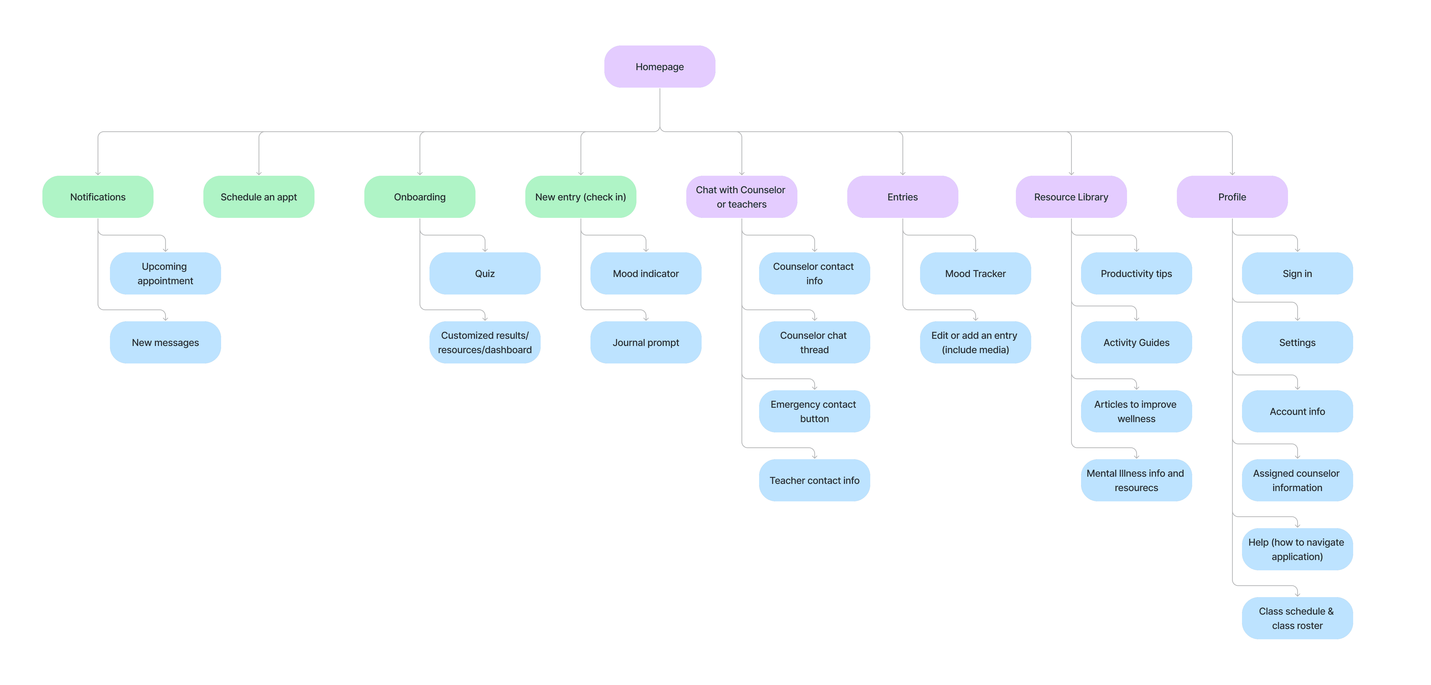
User flows & interaction design
Streamlined review process
To understand the current system's shortcomings, I conducted user interviews with the lead engineer, and fellow designers. They highlighted that the current design was outdated, unintuitive, and missing key information that helps moderators do their job. Additionally, new community features required additional functionality in the moderation system.
Understanding the typical moderator
Collaborating closely with the development team was essential to ensure alignment and feasibility. I held bi-weekly meetings with our lead developer, Jeffrey Li, to stay aligned with our goals and understand the technical constraints across all functions of the design. I also proposed solutions to potential roadblocks.
How might we help moderators make informed decisions and improve their work efficiency when monitoring user submitted reports?
execution
Mapping interactions
After clarifying my feature ideas and narrowing down to the must-have features for the MVP, I mapped out Lia Jane's paths and possible interactions for those features.
Wireframing
Early designs
I started out my wireframes by looking at Telehealth and other mental health applications as inspiration. My main focus was to make sure each element was clean and clear like any other healthcare app for accessibility purposes. Overall, my first drafts helped me map out the paths without getting too much in detail. Scroll to the right to view the wireframes.
UI Design
Bringing it to life
Testing & Iteration
Completion & satisfaction = A+
Inserting the UI elements into my wireframes led to multiple iterations of my high fidelity prototypes after a few feedback sessions with peers. Once I finalized the screens to the best of my ability, I conducted a usability test through Maze and gathered insights from 4 students who had completed the initial research survey.
My goals were to test the ease of use in navigation, observe the clarity of user flow, gather feedback on the UI, and observe any area of confusion or hesitation.
As a result, all students completed the tasks!
🤕 Pain points
Button states need more clarity
Overlay screens interactions were confusing
The meaning of icons was unclear
Continuing to capture the attention of users as this application deals with heavy topics
Accessibility in colors, the use of voice recording, etc.
✅ Successes
Color scheme is aesthetic, calming
Flow is straightforward, simple, and user-friendly
The organization is clean and neat
The interface is professional-looking
Users were enthusiastic about the possibility of the application being used in real life
👍 Changes
Overall, I was glad that the app was easy to use with a clear flow. Afterwards, I made only minor cosmetic changes such as clarifying button styles, updating the weight of the icons for consistency, clarifying the interactions of the overlays, and adding written text to the lower navigation icons for accessibility purposes.
Feedback highlight
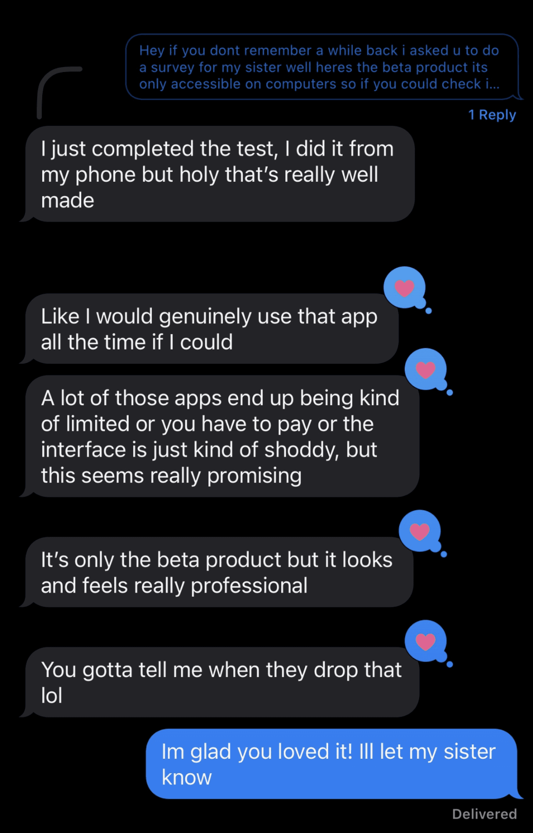
I asked a participant from my preliminary user research questionnaire to participate in the usability test, and this was her response. It's an incredible affirmation that my efforts are indeed on the correct path and that they can genuinely bring about change. My little brother helped me gather users at his high school and this is a screenshot he sent me of his conversation with that student.
Interactive Prototype
reflections
Conclusion
I felt satisfied with the results from my journey of creating Together. I was very intentional with the research and I believed that getting direct input from the students were very important to making this app successful.
📐 Measuring Success
As I take a look back at my project goals, my hope for the app is to ultimately create a positive impact on the students and institutions by accomplishing the following:
Increase awareness of mental health in schools
Increase usage of the app by faculty and students
Increase student and counselor appointment bookings
Improvement in student performance through academics, athletics, and at home
Students give feedback that they feel supported and see improvements in their everyday life
👩🏻🏫 What did I learn from Together?
1. Let the research lead the design. Speaking directly to current students allowed me to understand their real experiences which gave me context on how to create an app that wil be relevant and usable for the current generation. Throughout user research and usability testing, students were really excited to have this resource. They clearly understood what this app meant for them and how it can help their peers.
2. It’s easy to get caught up in creating an app only for the user themselves. Having a discussion about how the app will impact businesses and institutions is just as important because I can see how succeeding from a business perspective will help drive the development of the app even forward as there will be more hands involved.
3. Accessibility and ease of use reigned above aesthetics because healthcare apps are out there for everyone to use. In the future, I want to understand more about healthcare technology and what designers can do to make sure all kinds of users can benefit the product.
Say "Hello!"
joneiljescobar@gmail.com